
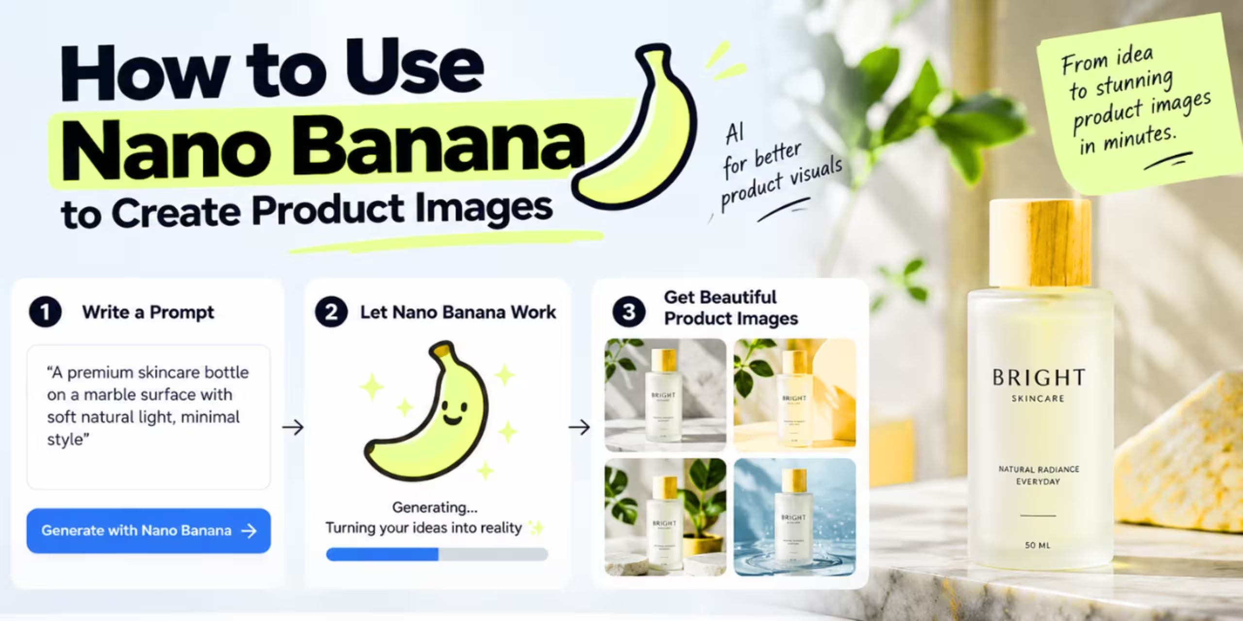
Every product needs photos. Good photos need a camera, lighting, a background, maybe a model, and a few hours you don’t have. Nano Banana skips most of that.
It’s the nickname for Google’s image model, officially Gemini 2.5 Flash Image, with a newer Pro version running on Gemini 3. It got popular fast because it does something most AI image tools are bad at. It edits real photos and keeps the product looking like the actual product. No melted logos. No item that changes shape every time you regenerate it.
I started using it because I was procrastinating on writing a completely different blog post and got distracted testing it on a candle sitting on my kitchen counter. That was three weeks ago. I’ve since run maybe forty images through it, mostly random stuff lying around my desk, an old perfume bottle, a phone case, a half empty jar of turmeric because it was the closest thing to my laptop at 11pm. Here’s what actually works, what breaks in annoying ways, and what I’d tell a friend before they waste an evening on it like I did.
What This Thing Actually Is
Nano Banana isn’t a standalone app from some indie developer. It’s Google’s own model, sitting inside the Gemini app under the image tools. You’ll see it wrapped inside third-party sites too, Pixlr, BasedLabs, and a dozen “banana” branded clones. They’re all calling the same model through Google’s API.
What set it apart early on was consistency. Older editors were fine at generating something new from a prompt, but ask them to change one thing in your existing photo and the product itself would shift. Different proportions. Different colours. Sometimes a different object entirely.
Nano Banana holds the object steady. You give it a photo, tell it what to change, and it changes that one thing. The product stays put. That’s the whole reason this matters for product photography instead of being another novelty for turning your face into an anime character.
Before You Open Anything
Get your base photo right first. This step gets skipped constantly, and it’s the biggest reason people end up with weird results.
The product needs to be in sharp focus. Well lit, ideally soft and even, not one harsh shadow slicing across it. Some space around the item instead of it jammed edge to edge. The background doesn’t need to be fancy, just not visually chaotic.
You don’t need a real camera. My first test was a photo of a candle taken under my kitchen’s yellow overhead bulb at like 9pm, and every single output came back with this weird orange tint no matter what I typed in the prompt. It took me four tries to realize the problem wasn’t the prompt, it was the light in my original photo bleeding into everything downstream. Next morning I shot the same candle near my bedroom window, cloudy day, no direct sun, and the outputs were night and day better on the first attempt. The model is trying to match lighting direction and color temperature from whatever you hand it. Feed it in a bad light and you’re fighting that mistake through every single edit after.
Where to Actually Use It
The Gemini app is the free, direct route. Open it, tap the tools menu, pick the image option, choose your model tier. Fast, Thinking, or Pro. Upload your photo, type your instruction, done. Start here if you’ve never touched it.
Third-party wrappers run the same model with extra features bolted on. Masking specific areas. Batch generation. Worth it once you’re doing this weekly for an actual store. Overkill for one product shot.
API access exists too, for anyone building this into an automated catalog workflow. That’s a different conversation. Get comfortable with the manual process first. Figure out what actually works before you automate it.
The Actual Workflow
Upload your base image. The model reads the real pixels of your product, not a description of it. This is why the starting photo matters so much.
Write a specific instruction. This is where people get lazy. “Make it look nicer” gives the model nothing. Try something closer to: place this product on a marble countertop, soft natural light from the left, small plant blurred in the background, keep the product’s shape, color, and label exactly as shown.
That last clause does real work. Tell it to preserve the product’s details and it listens. Skip that line and it sometimes takes liberties you didn’t ask for.
Look hard at your first output. It’s a draft. I say this because I almost posted one straight to my blog’s Pinterest before noticing, on the second glance, that the little embossed logo on my candle jar had turned into three random squiggly lines that weren’t letters at all. Zoomed out it looked completely fine. Zoomed in it looked like a toddler drew on it. Check proportions. Check that label text is still readable, actually readable, not just readable-shaped. Check for warping around edges, since fine text and mechanical detail are still weak spots.
Then keep going. Reply in the same thread. Make the lighting warmer. Shift the product left. Cut the plant, it’s too busy. Each edit builds on the last image instead of starting over, so your product stays visually consistent through the whole session.
Export once you’re happy. PNG or JPEG, and the higher tiers support up to 4K if you need something big enough to print.
Prompts Worth Stealing
For a clean listing shot: place this product on a plain white background, soft studio lighting from above, subtle shadow beneath it, no props, keep the product’s exact shape, color, and text unchanged.
For a lifestyle shot: show this product on a wooden table near a window, natural daylight, a coffee cup slightly out of focus in the background, warm mood, product stays sharp.
Notice the pattern. Describe the setting. Describe the light. Describe the mood. Then close with an instruction protecting the actual product. That closing line is not optional.
A Real Example, Including the Part That Didn’t Work
This is the actual candle from my kitchen counter, the one I mentioned earlier. Window light, cloudy morning, decent enough phone photo.
First prompt: place this candle on a neutral linen surface, soft window light from the left, small eucalyptus sprig near the base, keep the candle’s shape, label, and color exactly as shown. What came back was fine but wrong in a way I didn’t expect. The eucalyptus sprig was enormous, almost the size of the candle itself, sitting right in front of the label like it was trying to hide it.
Second prompt, same thread: make the eucalyptus smaller and move it away from the front of the candle so the label is visible. This is where it got a little annoying, honestly. It shrank the eucalyptus fine but somehow also shifted the whole candle slightly to the right, out of frame enough that I had to add a third instruction just to recenter it.
Third prompt: recenter the candle and warm up the lighting a bit, it feels a little cold. That one landed. Took four prompts total, not the clean three I’d like to tell you, and probably six or seven minutes once I factor in me staring at the screen deciding what was actually wrong with each version.
Still faster than what I’d have done otherwise, which is drag out my desk lamp, prop the candle on a folded towel because I don’t own a proper backdrop, and shoot it fifteen times hoping one isn’t blurry.
Where It Falls Apart
The scale gets weird. I tried placing a small glass perfume bottle, maybe four inches tall, next to a bathroom sink, and it came back looking like it belonged on a kitchen counter instead, oddly wide at the base, almost stubby. Took two more prompts specifically telling it to make the bottle slimmer and taller before it looked like the actual bottle sitting next to me. The model is reasoning visually, not measuring anything, so proportions drift and sometimes drift in ways that are hard to predict ahead of time.
Fine detail gets simplified. I have an old pair of wired earbuds I tested this on, mostly out of curiosity, and the cord came out doing this weird looping thing that doesn’t match physics, like it was tangled by an artist who’d only heard cords described secondhand. Cords, seams, tiny screws, woven texture up close, these are the spots where you’ll still need a manual touch-up in Photoshop or even just a basic phone editor.
This is not a one-shot tool for commercial-grade accuracy. Running paid ads where product fidelity actually matters? Plan on several rounds of prompting and some cleanup. Don’t expect a perfect result on the first try.
Google also adds an invisible SynthID watermark to outputs, plus a visible mark in some cases. Worth knowing. For most product photography it changes nothing.
None of this makes the tool bad. Think of it as a fast first draft generator that gets you most of the way there. Not a replacement for a photographer when pixel-perfect output is the actual requirement.
Nano Banana Against the Rest of the Field
Flux Kontext does strong editing work too, and some sellers prefer its style for certain jobs. But most comparisons floating around rate Nano Banana higher on keeping scenes and objects consistent across edits, which matters more for product work than for pure art generation.
Dedicated e-commerce photo tools exist as well, built specifically for product shots with a guided click-through flow instead of open prompting. These tend to be more reliable for plain catalog shots because they’re narrower in scope. They also cost more and give you less room to do anything unusual with the background.
Nano Banana is the flexible option. It rewards prompting skill and a willingness to iterate. In exchange you get far more range inside one tool, from clean catalog shots to full lifestyle scenes to weirder creative concepts, instead of bouncing between five different apps.
Running This Across a Whole Catalog
Doing this one photo at a time in a chat window gets old once you’re past a handful of products.
Keep a small set of reusable prompt templates. Swap out the product description and any specific detail each time. This alone saves a huge amount of back and forth.
Some third-party wrappers support real batch uploads, a folder of product shots plus one background style, processed in a single run. Worth exploring once this becomes a weekly task instead of an occasional one.
Save your successful prompts somewhere. Once you land on a lighting and background combo that matches your brand, reuse that exact phrasing on every new product. Your catalog ends up looking like one shoot instead of ten stitched together at random.
Different Product Types, Different Problems
Flat, simple items are the easy case. A candle, a bottle, a folded shirt. Clean shape, no moving parts, nothing that needs to line up with itself. These edit well almost immediately.
Jewelry is trickier. I borrowed my sister’s thin gold chain for a test, mostly because it was the smallest, fussiest thing I could find in the house, and the clasp came out looking fused shut, like a blob instead of an actual hook mechanism. The model can smear detail on anything under a certain size, so shoot these as close and sharp as you can before uploading. Flat lay worked noticeably better for me than propping the chain up at an angle, since it gives the model less guesswork about depth.
Anything with text or a logo needs a second look every time. Small labels can come out slightly blurred or with letters that almost read right but not quite. Zoom in before you publish. Don’t trust the thumbnail.
Products with cords, hinges, or moving joints are the hardest case. Headphones, hair tools, anything mechanical. Expect to run a manual fix afterward on anything under close inspection, because the model tends to simplify these parts rather than render them accurately.
Is the Paid Tier Worth It
Free access through the Gemini app covers most people. If you’re generating the occasional product shot, stick with it.
Paying for the Pro tier makes sense once resolution actually matters. Print work, large banner ads, anything getting blown up past a normal product page thumbnail. The free tier’s output is fine for a listing page. It’s not always fine at billboard size.
It also matters if you’re running volume. Batch tools built on top of the paid API save real time once you’re managing dozens of listings instead of a handful. Below that scale, the manual chat workflow does the job without costing anything.
Don’t upgrade before you’ve tested the free version properly. A lot of people jump to a paid tool assuming better output, when the actual issue was a weak base photo or a lazy prompt. Fix those first. Then decide if you need more.
Mistakes People Keep Making
Starting from a bad base photo and expecting the AI to save it. If the original is blurry or the product’s half cut off, no prompt fixes that.
Writing vague instructions and blaming the tool for a vague result. “Make it professional” tells the model nothing. Name the surface, the light direction, the mood.
Forgetting to protect the product’s details in every prompt. Skip that line and small unwanted changes creep in.
Accepting the first output instead of pushing back on it. The real strength here is the back and forth. Treat it like a vending machine, one prompt and done, and you’re leaving most of the value on the table.
Ignoring lighting direction in your prompt. If your base photo is lit from the left and you ask for a background lit from the right, the shadows on the product itself won’t match the new scene. Match the direction you already have, or say explicitly that you want it flipped.
Uploading a huge, uncompressed image and wondering why the tool struggles. Most platforms cap file size for uploads. A massive RAW export from a real camera can choke the process. Resize down to something reasonable first.
A Quick Word on Cost
Most people worry this is expensive before they’ve even tried it. It’s usually not. The free Gemini access covers a genuine amount of use, and even paid tiers run cheap compared to a single hour with a photographer. A proper product shoot for even ten items can run into real money once you count studio time, editing, and retouching. Nano Banana compresses most of that into a laptop and a spare afternoon.
That doesn’t mean it’s free labor. I spent an actual hour and a half on that one candle photo across the whole testing session, between the orange-tint mess and the misplaced eucalyptus and second-guessing the crop. It’s cheap. It is not effortless, whatever the ads for these tools want you to believe.
What This Actually Means
The real story isn’t AI replacing photographers. It’s AI removing the excuse for bad photos. A lot of small sellers are running stores on phone snapshots taken on a cluttered desk, because a proper shoot felt like too much money or too much hassle. Nano Banana closes that gap. You still need a decent base photo. You still need to review and push the output further.
Pick one product. Run a handful of prompt variations, expect at least one of them to come back weird for no obvious reason. Once you’ve got a template that clicks, this turns into a fifteen-minute job instead of a half-day one. Mine still isn’t fifteen minutes most days, closer to twenty five once I include the zooming in and squinting at logos part, but that’s still nothing compared to what I used to do, which was avoid taking product photos altogether and just reuse the same three shots for months.
One Last Thing on Consistency
If you’re building out a whole store, don’t just chase pretty individual images. Chase a repeatable look. A customer scrolling through your catalog notices when every photo feels like it came from a different planet. Same background style. Same lighting mood. Same angle logic across similar products.
That’s the part people skip because it’s boring. It’s also the part that actually makes a store look like a real brand instead of a pile of random listings someone threw together over a weekend. Nano Banana can give you variety fast. Use restraint and keep it consistent instead, and the whole catalog reads as intentional. That’s worth more than any single striking photo.
Save your best prompts in a plain text file. Reuse them without rewriting from scratch every time. Small habit, big payoff once you’ve got fifty products instead of five.